Therapy Practice Branding & Website Case Study | Petti Pathways
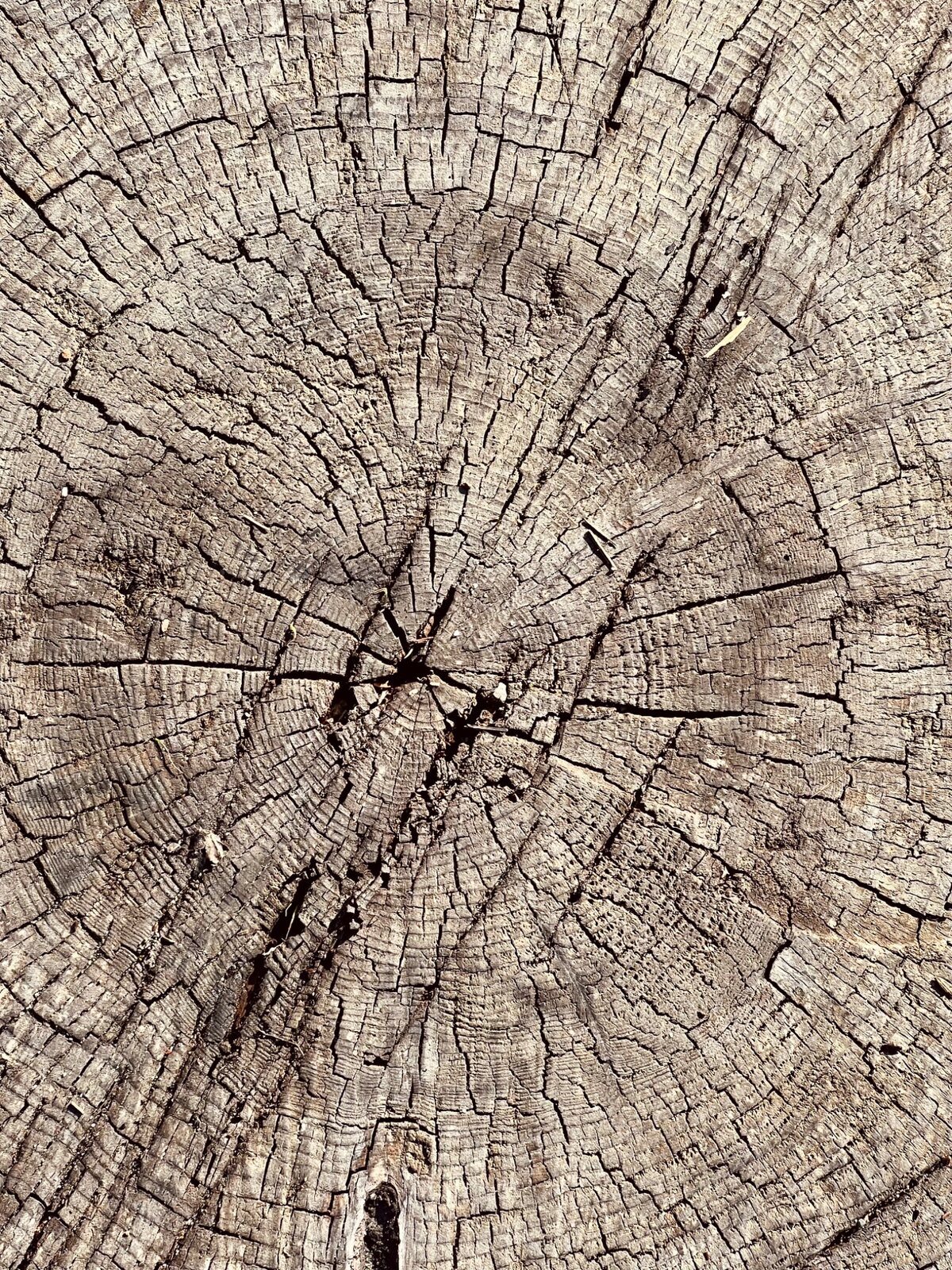
Close view of tree rings representing growth, grounding and reflection
All Work

Project 02 · Mental Health

PettiPathways

Brand Identity · Website Design

The Website, In MotionFour Service Pathways
The Palette{{ swMsg }}
4A8B8DACBAC7273B53F8F1E7

Teal · Mist Blue · Navy · Cream

01The Project

A Clear Path Into Care.

A brand and website that carry the depth of trauma-informed work with warmth, giving therapy, consulting, supervision and mentorship their own clear places to live.

Your Path Forward.

02 · First 90 Days

Selected Results

Post-Launch · 2026

3.1×Consult Requests
68%Inquiries From Search
2:14Avg. Time On Site
41%Lower Bounce Rate
04Service Pathways Launched
AAAccessibility Standard

03The Work

Grounded, Clear And Quietly Human.
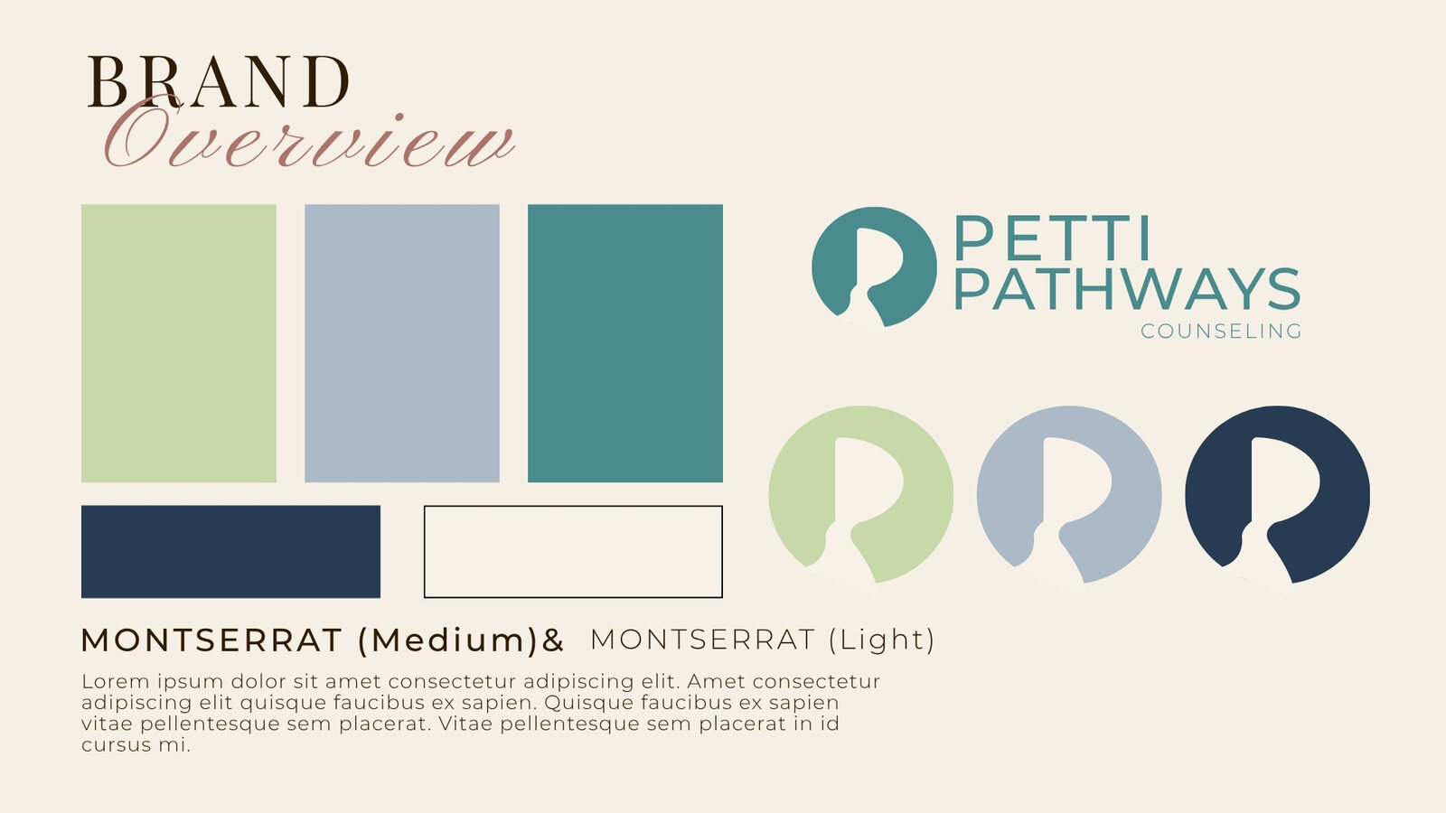
Petti Pathways brand board with teal, sage, blue and charcoal colors, logo marks and typography
01Brand Board · Palette, Type, Marks
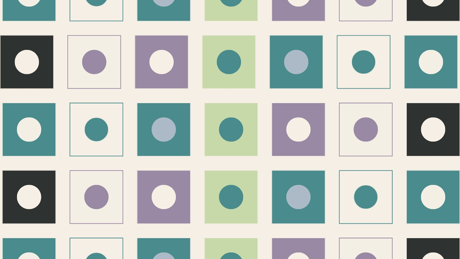
Petti Pathways repeating path-mark pattern in the brand palette
02Path-Mark Pattern
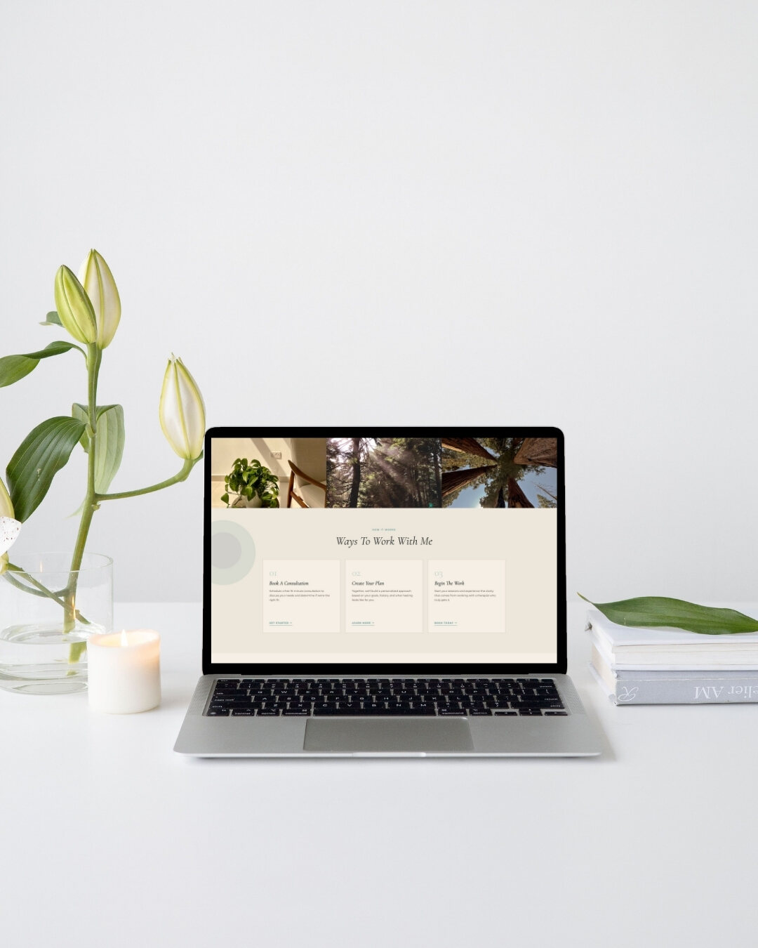
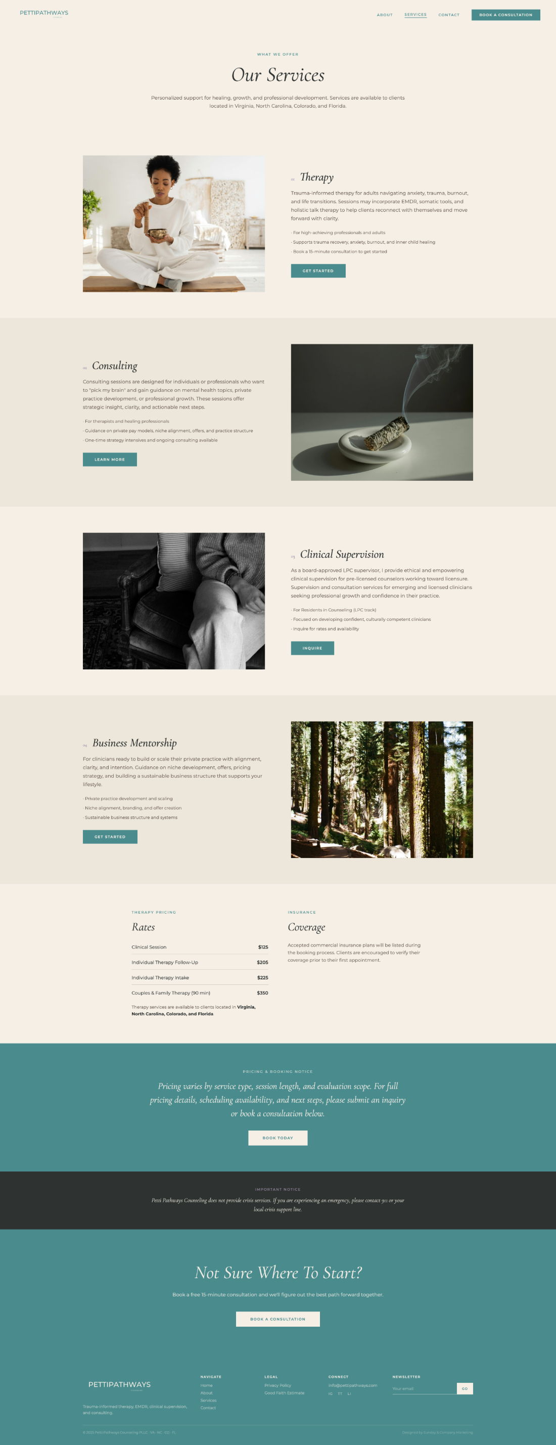
Petti Pathways website displayed on a laptop and mobile phone
03Responsive Build
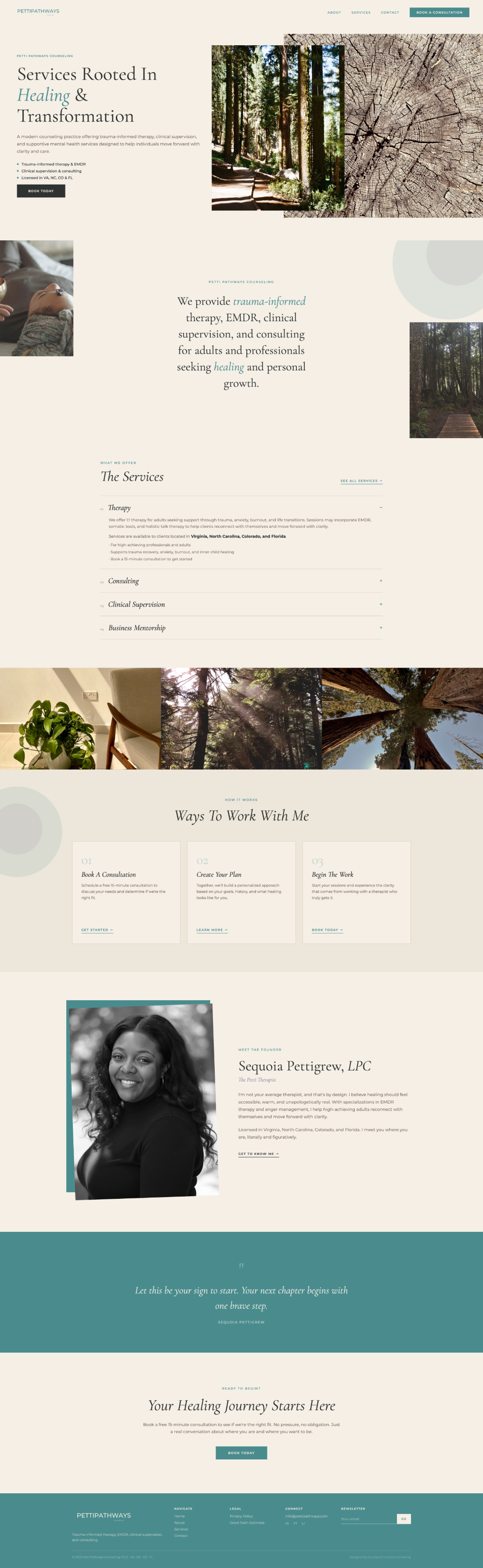
Petti Pathways Counseling homepage
04Home
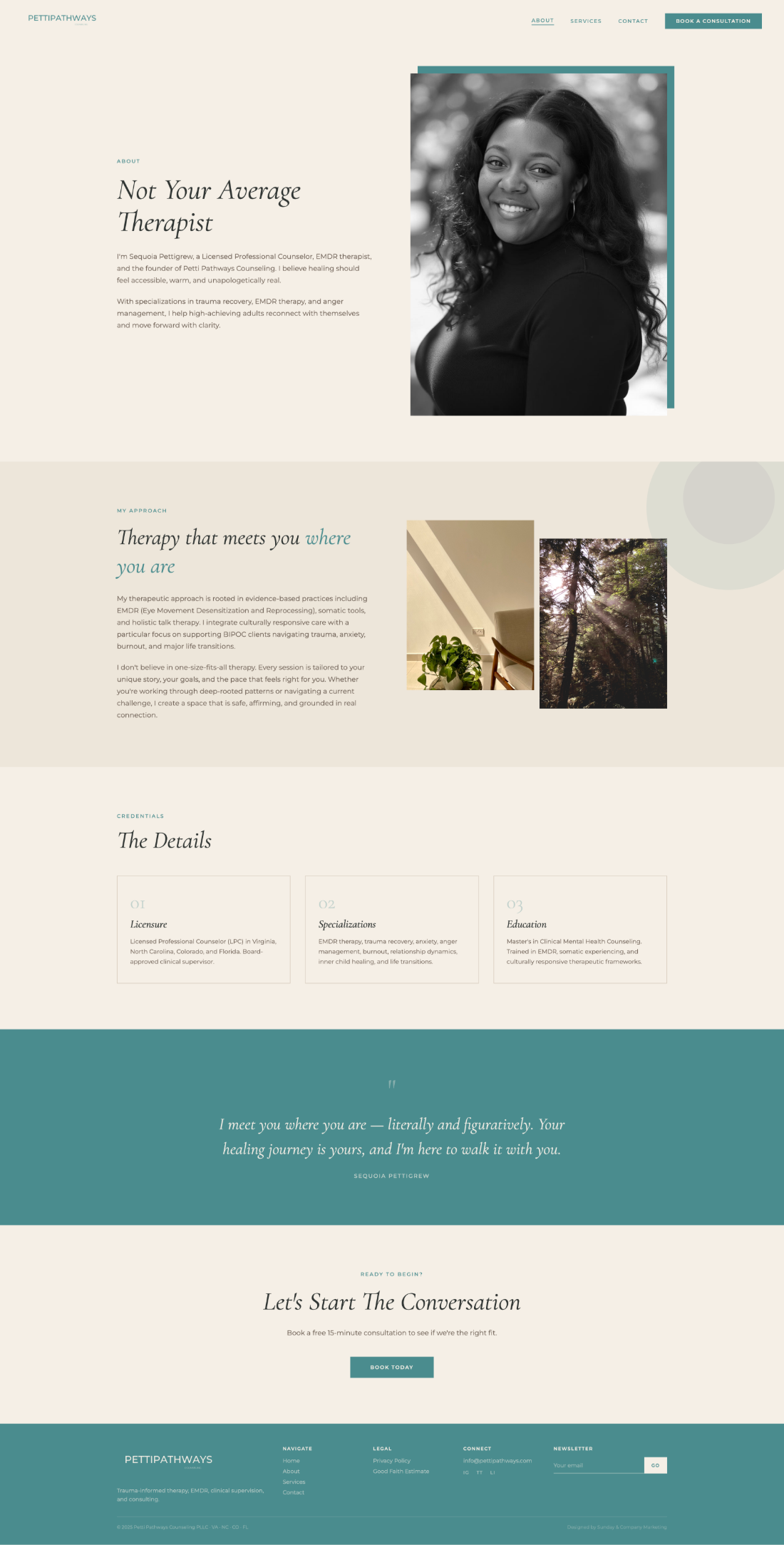
Petti Pathways About page
05About
Petti Pathways Services page
06Services
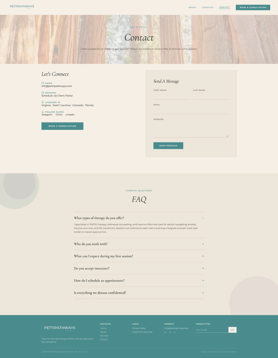
Petti Pathways Contact page
07Contact

Figures reflect actual results for this engagement over the period shown. They are not a guarantee or prediction of similar outcomes for other businesses.

Next

Lucky’s Café & Bakery

Next Project